


Color Identifier Color Finder
4.438.00 Reviews
App Specs
- Version
- 2.0.4
- Updated On
- License
- Free
- Downloads
- 50,000+
- Developer
- AppCraftingMinds
- Categories
- Art & Design
- Platform
- Android
Screenshots
 Analysis by AppCompare
When I’m choosing a paint shade, building a small design palette, or simply curious about the color of an object, I want more than a vague label like “blue.” Color Identifier Color Finder is designed for that moment: it identifies colors and presents them in practical code formats, giving me a starting point I can use beyond the camera view. Its central strength is turning a color I can see into a name and values I can refer to later. That is useful, but it also means the result is best treated as a helpful reference rather than a guarantee that a physical item will match perfectly.
One color, several useful ways to describe it
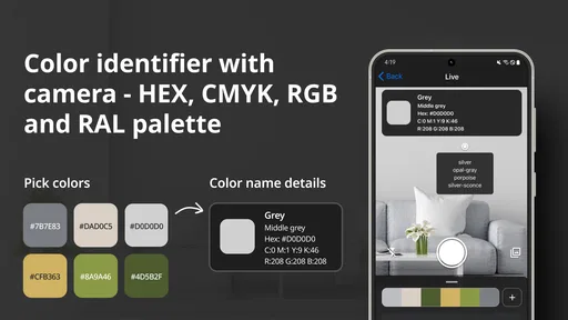
The app’s color identification is especially relevant when a shade is hard to describe in ordinary language. “A muted green with a little gray” might get the idea across to a friend, but it is not precise enough to guide a digital design or help compare options. A color name gives the shade a plain-language handle, while RGB and HEX values make it easier to carry that choice into compatible design tools. The app also covers CMYK and RAL, which can be useful when a project moves from a screen toward print or paint selection.
That range of formats is a practical advantage over relying on a generic camera or a simple color-picker tool. A basic picker may provide a value for a point on an image, but it may not help a casual user make sense of the shade or connect it with familiar color references. Here, the combination of a name and several code systems gives me more than a sample: it gives me a way to discuss, record, and revisit the color. The important caveat is that codes describe a color in a system; they do not ensure that paint, fabric, ink, and a phone display will look identical.
How I would use it in practice
For a useful result, I would first choose a surface that is evenly lit and place the camera close enough to focus on the color I actually care about. A patterned cushion, glossy packaging, or a surface with strong shadows can contain several competing shades, so aiming at a plain patch is more informative than pointing at the object as a whole. I would also compare the result in more than one lighting situation if the exact shade matters. A color viewed beside a window can look different from the same material under warm indoor lighting, and the app cannot make those conditions disappear.
A realistic example is choosing a wall color to go with a rug. I could scan a relatively solid patch of the rug, note the identified shade and its codes, then use that information as a reference while looking at paint options. I would not assume that a code from the phone is a final paint formula. Instead, I would use it to narrow down the family of colors, then check physical samples in the room where the paint will be used. That extra step avoids the common disappointment of choosing a color under one light and discovering that it feels too cool or too dark at home.
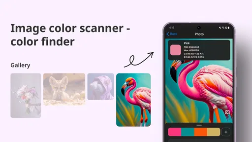
The same approach helps with digital projects. If I see a color in an illustration, object, or reference image and want to build a palette around it, identifying the starting shade gives me a concrete point to work from. The app’s complementary-color suggestions can then serve as ideas rather than rules. I would still judge the combination in the actual design: a pairing that looks balanced in isolation may be too loud for a poster or too low in contrast for text. Treating suggestions as a prompt for experimentation is more useful than accepting them automatically.
Discovering the Colors Around You
First off, the app is super intuitive. As soon as you open it, you're greeted with a sleek and straightforward interface. The main feature is the ability to point your camera at any object and have the app identify the exact color. I found this really handy while redecorating my living room. I mean, who knew there were so many shades of blue?
Worth Reading Before You Choose

EA SPORTS FC Mobile 26 Is a Bigger Football Game, but It Takes Time

Flipboard Shows What News Apps Must Do Beyond the Feed

Switching to Android Auto Means Rethinking Your Driving Routine

Google Calendar Makes a Crowded Week Easier to Manage

Ludo King Makes the Most of the Minutes Between Plans

Baby Panda World Brings Quick Play to Modern Phones, but Its Game Library Feels Busy
Once you’ve identified a color, the app gives you its name, along with the RGB (Red, Green, Blue) and HEX codes. This is particularly useful if you're working on design projects or just trying to match paint colors. It's like having a color dictionary in your pocket!
Handy Features
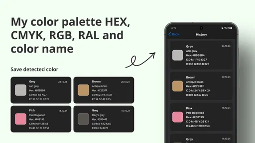
Beyond the basic color identification, the Color Identifier Color Finder also lets you save your favorite colors. I found this feature pretty neat because I could create a personalized palette over time. Planning a DIY project? Just snap all the colors you want to use and keep them stored for easy access later.
Another cool feature is the app’s ability to suggest complementary colors. If you’re like me and struggle with color matching, this feature will save you a lot of headaches. It suggests colors that pair well with the one you’ve identified, making it ideal for designing outfits, rooms, or even digital art.
Usability and Performance
Using the app was a breeze. It’s lightweight, meaning it doesn’t hog your phone’s resources, and it runs smoothly even on older devices. I appreciated the lack of intrusive ads; nothing kills the creative vibe more than pop-ups while you’re in the zone.
The precision of the color detection is impressive. I tested it in various lighting conditions, and it consistently delivered accurate results. Just make sure your phone's camera is clean for the best experience. I had a bit of a moment when it identified my dusty table as "Desert Sand." Lesson learned!
Where the result needs a little judgment
I would be cautious about reading “exact color” too literally. A phone camera captures light reflected from an object, and the result can be affected by shadows, glare, nearby colors, and the camera itself. A shiny surface may reflect the room instead of showing its true material color; a textured surface can vary from point to point. For a casual identification, that is usually fine. For a purchase or a production decision, I would use the app to identify a direction, then check the real-world sample before committing.
There is also a difference between a color that looks right on a screen and one that reproduces well in print or paint. RGB and HEX are convenient for digital work, while CMYK is associated with print workflows and RAL can help when working with standardized paint references. Those formats make the app more versatile, but translating between them is not the same as guaranteeing a perfect match across materials. If I were preparing a brand asset or ordering a large quantity of material, I would confirm the color with the relevant supplier or design workflow rather than treating a camera reading as the final authority.
One useful habit is to save a small set of related shades instead of relying on a single scan. When comparing a fabric or room palette, I would capture a few distinct areas in consistent light and review them together. This can reveal whether I am drawn to the object’s main color or to a smaller accent that first caught my eye. It also gives me a more dependable reference if I return to the project later, rather than relying on memory or trying to recreate the same camera angle.
Who will get the most from it
If you’re a designer, artist, or just someone with a love for colors, this app is a fantastic tool to have. It’s like having an art studio in your pocket, ready to help you explore and understand the world of colors better. Plus, with the ability to save and organize your favorite colors, it’s perfect for anyone who enjoys a bit of creativity in their daily life.
Also, if you’re someone who struggles with color blindness, this app could be incredibly beneficial. It simplifies the process of identifying colors, making life just a little bit easier and more colorful.
I can also see it helping someone who shops for clothes, chooses accessories, or collects visual references for a craft project. If I wanted to find a thread color that sits close to a favorite item, I could use an identification as a starting point, then compare the physical materials side by side. For a small hobby project, that can save time and make color conversations easier. For a professional workflow that depends on calibrated output, specialist color-management tools and physical proofs are still the safer choice.
The app is less compelling if all I need is a one-off pixel value from an image I already have open in an editor. A built-in eyedropper may be quicker in that situation, especially when I need to sample a precise location on a digital image rather than identify a color in the room around me. Likewise, someone making a high-stakes accessibility or print decision should not rely on a camera-based label alone. The best fit is the person who wants a quick bridge between seeing a color and having usable words or codes for it.
What to expect before installing
Color Identifier is an art and design app from AppCraftingMinds, and it is free to install. It has a 4.7 average from 742 ratings, with 50K+ installs, and is rated for Everyone. The current version is 1.9.9, and it requires Android 8.0 or later. Optional in-app purchases range from $4.99 to $59.99 per item, so I would check the purchase details in the app if I’m considering anything beyond the free experience.
Those details make it approachable for a quick trial, but I would still think about how often I actually need color references. If I work with palettes regularly, saved colors and multiple code formats can earn their place on my phone. If I only wonder about a color once in a while, the free starting point may be enough, and there is no reason to buy anything before I know which parts of the workflow I use.
Final Thoughts
All in all, Color Identifier Color Finder is a must-have for anyone interested in colors. It’s user-friendly, accurate, and packed with features that make identifying and organizing colors a breeze. Whether you’re redecorating your home, creating digital art, or just curious about the colors around you, it’s a game changer.
So go ahead and give it a try. Who knows, you might just find a new favorite color!
Pros
- Accurate color detection in various lighting.
- Simple
- user-friendly interface.
- Supports color-blind accessibility.
- Offers color codes for design use.
- Works offline without a data connection.
Cons
- Occasional inaccuracies in low light.
- Limited features in free version.
- Ads can be intrusive at times.
- No support for batch color detection.
- Lacks advanced design tools integration.
FAQs for Color Identifier Color Finder
What is Color Identifier Color Finder and how does it work?
Color Identifier Color Finder is an app designed to identify and provide detailed information about colors using your device's camera. Simply point your camera at any object, and the app will analyze the color and provide its name and RGB values. It's particularly useful for designers, artists, and those with color vision deficiencies.
Can Color Identifier Color Finder be used offline?
Yes, Color Identifier Color Finder can be used offline. The app uses your device’s hardware to detect colors without needing an internet connection. This makes it convenient when you are in areas with poor connectivity or when you want to save data usage.
Is Color Identifier Color Finder compatible with all devices?
Color Identifier Color Finder is compatible with most Android and iOS devices. However, it requires access to your device’s camera, so ensure that your device has a functioning camera and meets the minimum operating system requirements specified on the app’s download page.
Are there any accessibility features in Color Identifier Color Finder?
Yes, the app includes accessibility features to assist users with color blindness or low vision. It provides audible color descriptions and adjustable text size for better readability, making it an inclusive tool for identifying colors accurately.
Does Color Identifier Color Finder have any additional features?
Besides identifying colors, the app offers a color palette generator and the ability to save and share identified colors. These features are ideal for creative projects, allowing you to keep track of colors and collaborate with others easily.


